A handy burn-down chart excel template
A burndown chart is a common tool for reporting the progress in scrum or umbrella term “agile” world. It is a very pragmatic and simplest way to check progress of the work, if its on time, it will end at zero. It also gamifies the work if teams frequently look at it, with an aim to finish it to zero. That makes it easy to understand by anyone in the team or management. If you are using the application lifecycle management (ALM) tools like Microsoft Team Foundation Server / Jira / Mingle etc, this comes in as a featured report.
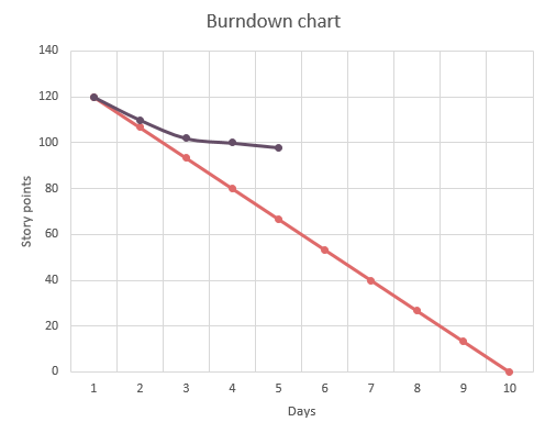
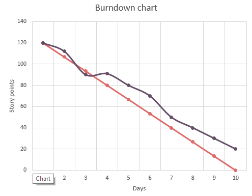
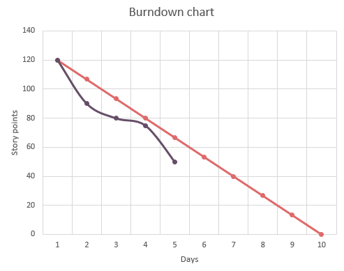
A typical burndown chart would span across a time period. I would start off with a certain quantity of stuff and progressively reducing that quantity. Examples of burndown charts in software development can be like below
-
Release burndown
-
Sprint burndown
-
Defects burndown
Common trends observed in the burndown charts are like below:

Above shows an underestimated amount of work or it also shows slack or not enough progress in the time period.

Above shows an overshoot and there is an offset due to more work added in between, which leads to an incomplete sprint (doesn’t end at zero).

Above shows that the work has been overestimated. Actually it has been completed faster than estimated. The team can add more work, and there is a need to re-estimate.
Generally, anyone can use burndown charts, even construction contractors, editors, movie makers, basically the people who want to manage an estimated amount of work over a period of time. I have made a simple template in MS Excel which will help chart the burndown of any work.
####Using the template
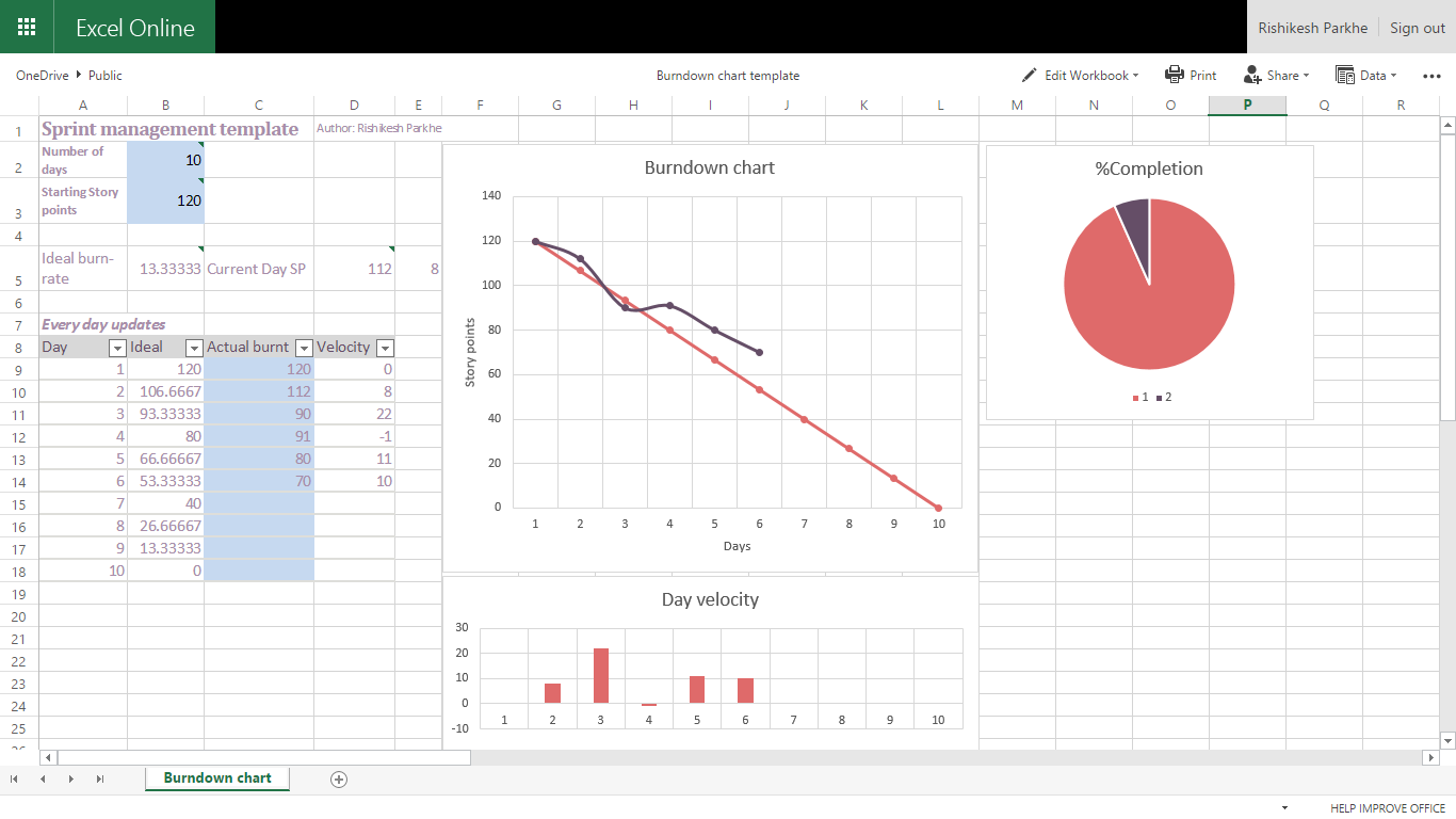
Download the template from the location below. Observe the total amount of work you have started with and feed the “Starting story points” field. Provide the “Number of days” in the sprint. Now observe the work completed during each day and record the new value of the remaining work at the end of each day. I haven’t created the table for the details of work items (Tasks), as that can vary from requirement to requirement.

In the above template, there is a visual for the burndown, total amount of work completed and daily velocity. I have found that the daily velocity charting does help manage the sprint better, if the concerned people watch the day’s velocity they will notice the slack / excessive speed and apply corrections accordingly. The pie chart is a very nice way to find out what percentage of the work has been completed, generally burndown charts don’t give this type of feeling.
I hope this will be useful to people without the ALM tools. Happy work management…
Download the template here: One drive link
More posts
